

Words by Jake Iza | Published 18.09.2026If you showed me Liverpool’s first ever kit and didn’t say whose it was, honestly I’d never guess it was us.
Blue-and-white quarters, navy shorts, no Liver bird. It looks more like Blackburn than Liverpool. Bit weird really.
I’m 16, so nearly all these shirts reached me through old photos, footage, retro shops and older fans telling stories. People my age don’t remember most of Liverpool’s history. We pick it up from older fans.
By the time I started properly watching, all red didn’t feel like a choice. It felt like a rule nobody needed explaining.
The full switch to all red was finished in 1964. After that, different shirt makers, sponsors and big wins made all red feel more and more like Liverpool.
1892-1896: The Shirt That Doesn’t Look Like Liverpool
Liverpool started in 1892 wearing blue-and-white quarters with navy shorts and socks, using old Everton kit left at Anfield.
The shirts were heavy cotton, more like rugby tops, with no names, numbers or badge. A modern replica added an emblem taken from an 1892 club letterhead, but Liverpool’s museum team clearly said it wasn’t on the original playing shirt.
That first kit matters because it proves Liverpool’s look wasn’t inevitable. The red, the badge and the whole shape of the kit had to be worked out. Four years later, blue and white was gone.
Imagine Anfield full of blue-and-white scarves instead of red ones. It sounds ridiculous now, but it easily could’ve happened.
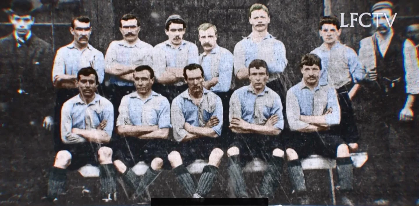
Colourised interpretation of one of Liverpool's early blue and white kits.
Photo Credit: Liverpool FC TV
1896-1964: Red Arrives, But Not All Red Yet
Liverpool changed to red shirts and white shorts in 1896. There’s loads of variation after that with collars, socks and shades, but red over white stayed as the basic look.
This era is a pain to research because most pictures are black and white. You can see the shirt, but not always what colour everything was. Basically, the caption underneath the photo is doing half the work.
The Liver bird badge was commissioned for the 1950 FA Cup final, but the shirt debuted at Portsmouth a week earlier. That badge only appeared occasionally on change shirts. The red home shirt got a new oval Liver bird in November 1955.
The red shirt looks right in those photos. Then you reach the white shorts and it feels like two kits got joined together.
It was nearly the Liverpool kit we know. Just not quite.
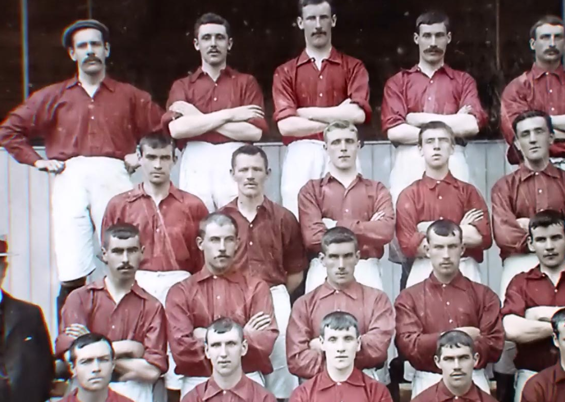
Most of what we know about Liverpool's early red kits are down to interpretation and guesswork.
Photo Credit: Liverpool FC TV
1964-1973: Shankly Completes The All-Red Look
There’s one detail people often get wrong about the all-red story.
Before Liverpool played Anderlecht on 25 November 1964, Bill Shankly asked captain Ron Yeats to try red shorts with the red shirt. Shankly loved how much bigger and more intimidating he looked. Red meant danger and power, and the matching kit made the players look like one proper unit.
Liverpool won 3-0, but they still wore white socks. So it wasn’t fully all red yet.
That happened in the away leg on 16 December, when red socks completed the strip. Roger Hunt scored a last-minute winner, then Liverpool wore the full kit at Wembley while winning their first FA Cup in May 1965. The change really happened in two stages.
People often tell it like Shankly changed everything in one night and that was it. It actually took two matches.
It sounds like a tiny change, but matching one colour made the whole side look bigger, stronger and much more recognisable.
I never saw Shankly’s team, but every Liverpool home shirt I’ve known comes from that choice.
All red. Proper Liverpool.
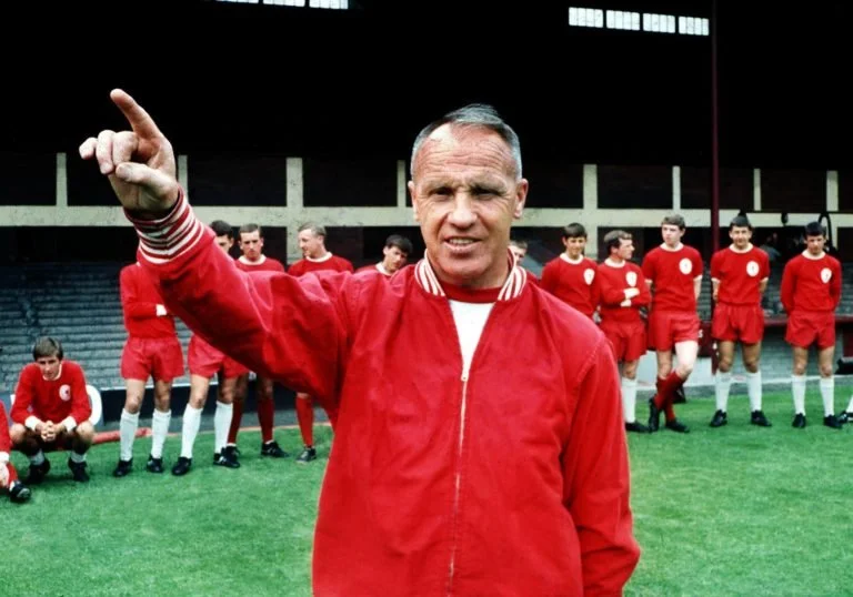
The Shankly era is one of the most iconic in Liverpool's history, both for kits and trophys.
Photo Credit: Panenka
1973-1985: Umbro, Sponsors and the Pinstripe Argument
Umbro had made Liverpool clothing before 1973, including the 1950 cup shirt. The change in 1973 was that visible Umbro branding started appearing regularly.
That double diamond was on Liverpool during the European Cup wins of 1977, 1978, 1981 and 1984. Hitachi became the club’s first shirt sponsor in 1979, followed by Crown Paints in 1982.
From then on, you could almost date a Liverpool shirt just from the logo and whatever company was written across the front.
Then came thin white pinstripes. Some supporters hated them because Liverpool were meant to be all red. To be fair, I get it.
But Liverpool won the league, League Cup and European Cup in the 1983-84 pinstriped shirt, which normally ends the argument. The stripes first appeared on the 1982-83 design.
Older fans can date those shirts instantly. I work backwards from Crown Paints, the Umbro logo and those little white lines.
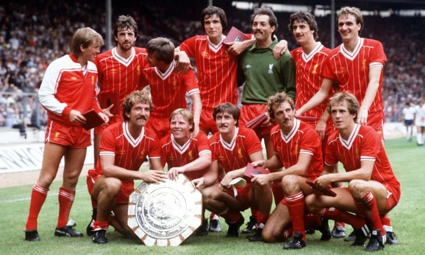
Liverpool's Umbro kits are some of their most iconic.
Photo Credit: TalkSport
1985-1996: Candy, Adidas and Carlsberg
Adidas replaced Umbro in 1985 and Candy became the sponsor in 1988. Then came the geometric home shirt worn from 1989 to 1991.
This shirt should be too much.
White shapes through the red, three stripes, a big sponsor and a busy collar. Somehow it works. It just looks class, especially long-sleeved. Liverpool winning the 1989-90 league title in it obviously helps.
Carlsberg replaced Candy in 1992 and stayed for 18 years. The logo crossed different teams and manufacturers: Fowler, Owen, Gerrard, Torres and Istanbul all fit inside the same sponsorship era. The sponsor timeline is basically a second Liverpool history.
After a while, you barely see it as an advert anymore. You just link it with a player or match.
I knew Candy and Carlsberg as logos on retro shirts before I knew the teams. You see that geometric Candy shirt at a match or sixth form, then find out it belongs to the last title-winning side before 2020.
Sometimes I see the shirt first and learn the history afterwards.
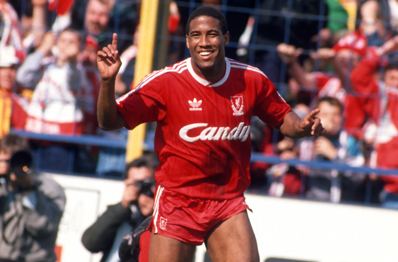
Liverpool's Candy sponsor was short-lived but is fondly remembered.
Photo Credit: Getty
1996-2015: Reebok, Istanbul and Warrior
Reebok made Liverpool’s kits from 1996 to 2006. Its most famous one isn’t even that complicated: red, white details, Liverpool crest and Carlsberg across the front.
Then Istanbul happened.
I wasn’t born when Liverpool played AC Milan on 25 May 2005, so I’m not going to act like I remember it. I know the footage though: 3-0 down, Gerrard, Šmicer, Alonso and Dudek in the shootout.
I know what happens every time and it still looks impossible.
That night made a simple Reebok shirt untouchable. Put it beside ten other red kits and it’s still the Istanbul one. No debate.
I’ve watched the footage so many times that the shirt feels familiar from every angle, even though the memory isn’t actually mine.
Adidas returned from 2006 to 2012, then Warrior took over. New Balance already owned Warrior when the deal began, and switched the Liverpool kit branding to its own name in 2015. The corporate bit isn’t that interesting. The shirts are.
Warrior’s first home kit brought back the single Liver bird, which was a really nice link to the past.
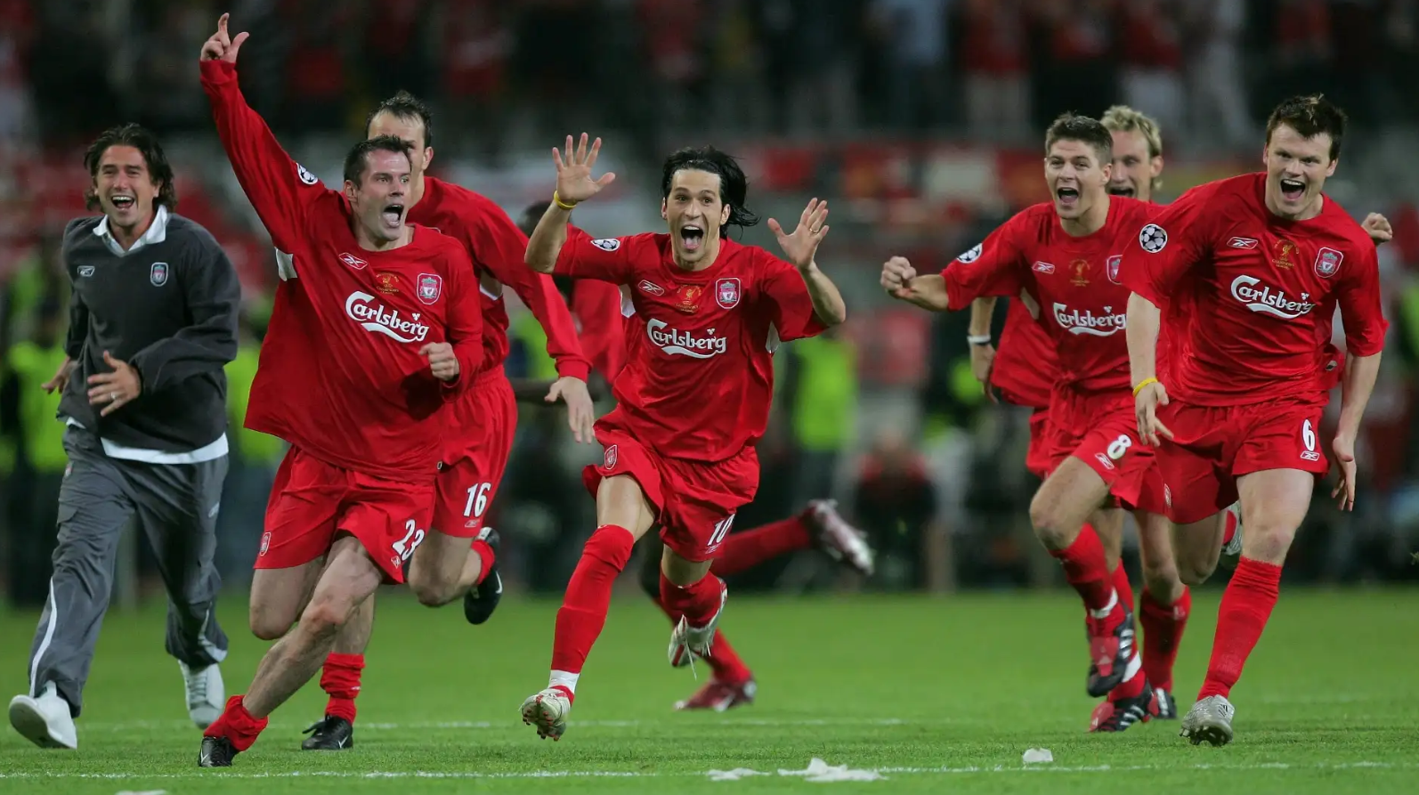
Sometimes kits are iconic because of the memories and matches attached to them as well as the design.
Photo Credit: Goal
2015-Present: The Shirts I Grew Up With
This is the point where I actually remember the shirts myself.
New Balance arrived in 2015. Those darker red shirts belong to Klopp’s Liverpool in my head: Salah, Mané, Firmino, Van Dijk and the Champions League win in 2019.
The 2019-20 shirt used thin white pinstripes inspired specifically by the 1982-83 design, while also marking 100 years since Bob Paisley’s birth. Liverpool won the league in it. Fairly important one, then.
COVID-19 extended the season, so New Balance remained until 31 July 2020 and Nike started the next day. Liverpool therefore lifted the trophy in New Balance even though the Nike deal had already been announced.
Those shirts feel different because I actually watched Liverpool play in them. I didn’t discover them years later in a retro shop.
I could judge them when they came out, before knowing which trophies or horrible defeats would eventually get attached to them.
Nike made the kits from 2020 to 2025. Then adidas returned for a third period on 1 August 2025, beginning an official ten-year partnership.
The 2026-27 home shirt brings back the geometric pattern from 1989-91. I only knew that design from old photos, so it feels a bit strange seeing it come back now. Older fans know the original and younger fans get our own version.
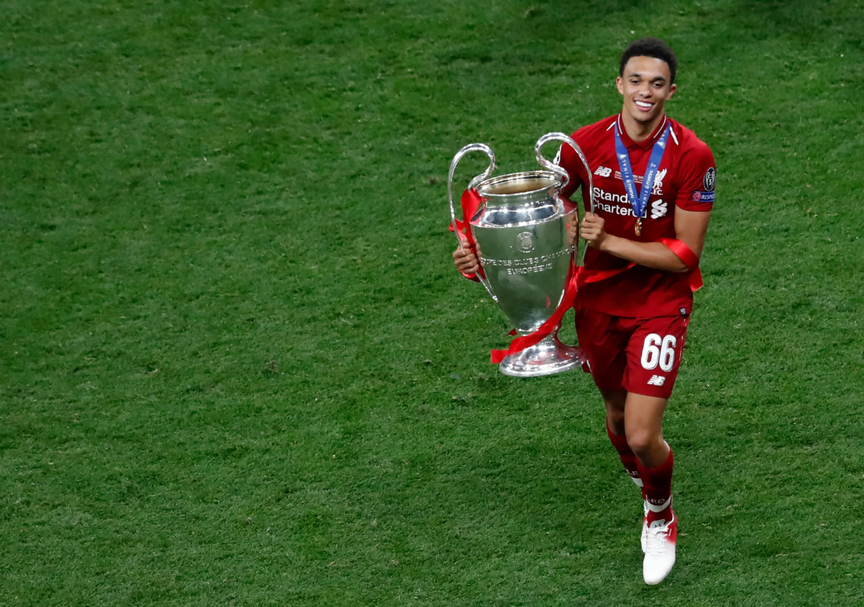
New Balance, for all people feel indifferent about them, are now attached to some of Liverpool's most iconic moments.
Photo Credit: The New York Times
Put the 1892 shirt beside today’s one and they look like different clubs.
Red arrived first. The Liver bird followed. Shankly matched the shorts and socks. After that, brands changed the details and trophies made certain shirts impossible to forget.
Older fans remember the original moments. I only know them from clips, shirts and stories, but they still feel part of the club.
I wasn’t there when Shankly chose all red.
I just grew up thinking Liverpool could never be anything else, and now I know why.